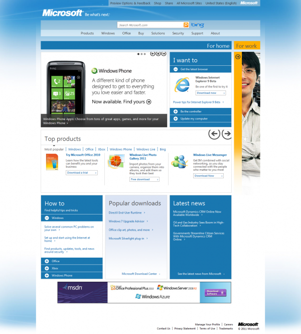
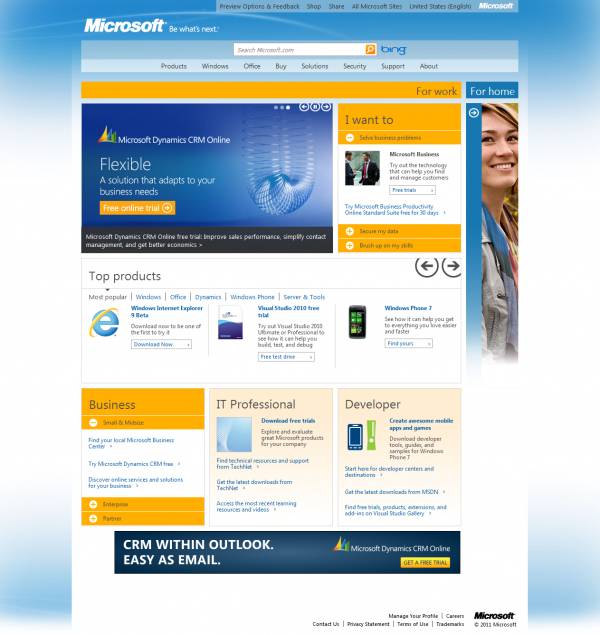
Today, Microsoft unveiled a preview of upcoming homepage of microsoft.com. The appearance has been revamped totally and inspired by Windows Phone 7 Metro UI with new tag line Be what’s next.
In this preview, every section is treated as a Tile and all Microsoft products have been divided in two broad categories viz. For home and For work, featuring as titles with side-scrolling.

For home tile showcases consumer oriented products including Windows Phone 7, Internet Explorer 9, Windows Live Essentials, Microsoft Security Essentials, Kinect for XBOX 360 and so on. Besides three tiles give quick access of how-to articles, popular downloads and news feed.

Whereas For work tile totally features business oriented products like Windows 7 Professional, Visual Studio and others including enterprise services for both IT professionals and developers.
The new look is really charismatic and light weight. You should give a look to microsoft.com preview.
Leave a Reply