Microsoft has made available their Office 2010 Technical Preview to invite only participants and we got it too. Thanks Microsoft!
Office 2010 system hits its first major milestone, we have just installed it and covered few aspects of Office 2010 Technical Preview. This time, Microsoft has made available both 32bit and 64bit versions of Office System. The build string is 14.0.4006.1110, i.e. different from leaked one. Ribbon UI is the default interface for all Office applications now, adding a host of new features to individual applications such as video editing in PowerPoint and improved mail handling in Outlook and introducing a number of Office-wide productivity enhancers, including photo editing tools and a much-improved paste operation.
Office 2010 SKUs
- Office Professional Plus
- Office Professional
- Office Standard
- Office Home and Student
- Office Home and Business
(In Office 2010, the Enterprise, Small Business and Ultimate editions are no longer exist)
Notable Changes:
The Ribbon UI is in center now
In Office 2010, all applications now share the common Ribbon interface, including Outlook, OneNote and all other Office applications. The Office button in upper-left corner has been tweaked and slightly moved down from its previous location.

OutSpace
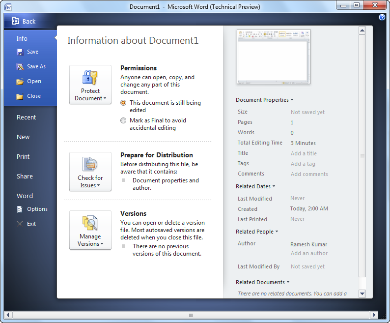
It’s a new addition to Office 2010, when we click on Office button, it brings up Outspace, that covers information about documents and common tasks such as printing, save and save as etc. beside it, The Info tab has taken place this time, which is particularly useful, giving important information about current file, such as the author and last time it was modified etc.
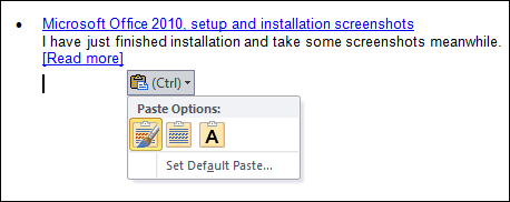
Paste Preview (Word)
It appears when we paste text or images into a document. It helps, when something is copied from a formatted Web site and pasted into Word, a hovering window appears titled "Paste Options" and it lets us choose to paste with formatting or without before committing it to the document.
Sparklines (Excel)
These are pretty much smaller charts that usage data from cells and show into a cell, which gives an easy way to represent complex numbers and data without chunking it into one graph.
Video Editing (PowerPoint)
A new feature is basic video editing tools built into PowerPoint, it adds functionality to play videos through PowerPoint slide show.
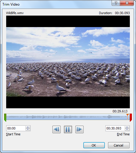
It plays AVI and WMV files only and may requires third-party codec for other file types. Beside it, we can embed videos from online video-sharing sites such as MSN Videos, YouTube etc. To do this, just copy the video code shown on website and paste into PowerPoint slide. It’ll play video as part of presentation, although it requires an Internet connection.
Quick Steps and Jump List(Outlook)
Quick Steps perform common tasks with one click like Forwarding, Reply, Move To etc.
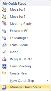
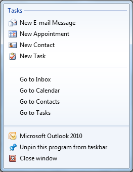
Additionally outlook got jump list too that includes tasks and locations.
Path to RTM
As we blogged earlier, Microsoft also revealed that it planned to introduce Office 2010 to manufacturing in first half of 2010 at WPC09. It’s a Technical Preview only, so it’s quite expected that Office 2010 still has a long way to go before it reaches Beta and RTM release.
Leave a Reply