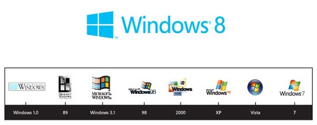
Over the past week, there was a gossip about new logo of Windows 8. And today Microsoft has officially confirmed that it wasn’t just a gossip – it is true and there is new logo for the upcoming Windows sensation.
We have said that Windows 8 is a complete imagination of the Windows operating system. Nothing has been left unexplored, including the Windows logo, to evaluate how it held up to modern PC sensibilities. The Windows logo is a strong and widely recognized mark but when we stepped back and analyzed it, we realized an evolution of our logo would better reflect our Metro style design principles and we also felt there was an opportunity to reconnect with some of the powerful characteristics of previous incarnations.
We had a very short list of agencies that we wanted to work with on the redesign of the logo and were thrilled when Pentagram agreed to join us in the project. Pentagram’s illustrious history speaks for itself, but we were particularly attracted to their sense of classic graphic design which fit well with our Metro design principles.
– Sam Moreau, Principal Director of User Experience for Windows.

In the blog post, Microsoft has also posted a leap of old Windows logos from Windows 1.0 to 7 that how they advanced Windows logo and somewhere it lost its origin and became a flying or waving flag. Undoubtedly the new logo is based on Metro design principles with bold flat colors (monotonous) and clean lines and shapes but it is true window.
Well, Windows 8 logo is here and I must say hi to window and bye to flag.
Leave a Reply