Few months ago, we reviewed Technical Preview of Office 2010, where we elaborated major changes of Office 2010. Since the release of Technical Preview, Microsoft has been getting lots of feedback for UI design changes. They have made lots of changes for the first Beta release of Office 2010.
Here are the few changes in Backstage View.
1. File Button:
The Office button has been labeled as “File”. It’ll bring back the usability File menu and their commands like “Save As”, “Print” etc. It is must, because all the years of using the File menu and it’s too hard to break the habit.
| Technical Preview | Beta(Coming later this Fall) |
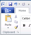 |
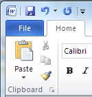 |
2. No More Back Button:
In technical preview, the back button covered the whole document. This time the Back button has been eliminated and Backstage View is treated as like other Ribbon Tab.
An important change has been to keep the Ribbon tabs visible and usable while we are in the Backstage view. This makes the Backstage work much more like any other Ribbon tab – a metaphor people are already familiar with. In addition to clicking on the document thumbnail or pressing ESC, we can simply click on any one of the other Ribbon tabs to get back to document and use those commands, just as we would switch between other Ribbon tabs.
| Technical Preview |
 |
| Beta |
 |
3. Re-furnished Visuals:
Microsoft has implemented nearly final set of visuals for the Backstage view. They have worked to develop a set of visuals that help make the Backstage easier to browse and make the transition between document and the Backstage feel smoother.
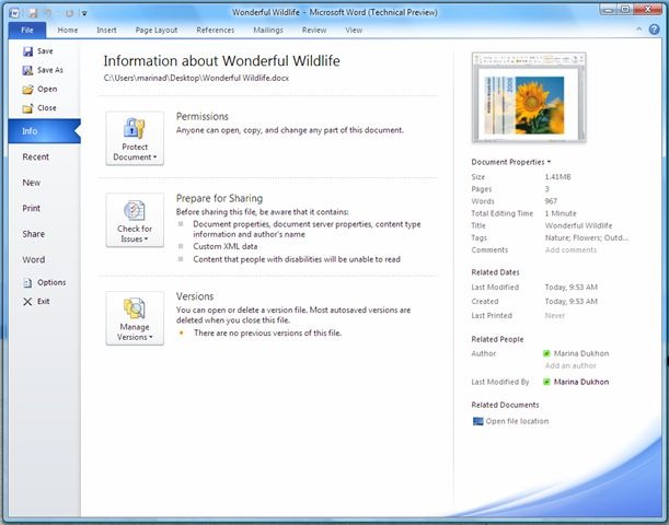
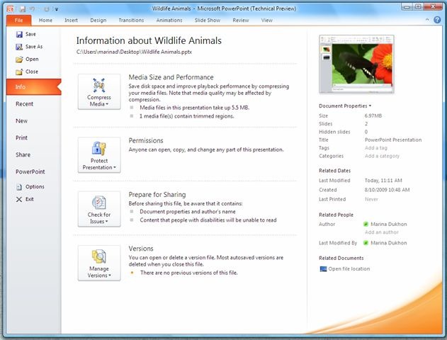
4. Organization of Navigation Commands:
In the upcoming beta, the efficiency of “Quick Commands” has been enhanced, located in left side pane. Commands like “Save”, “Save As”, “Open“ and “Close” are no longer located beneath the “Info” tab, beside it “Options” and “Exit” are also no longer associated with the last tab, which has been renamed to “Help”, which reflects better usability of quick commands than earlier.
| Technical Preview | Beta |
 |
 |
5. Most Recently Used Documents:
In Beta, Quick Access Toolbar has got another useful toolbar called “Open Recent File”, which will switch to Backstage View directly to the Recent tab.

Beside it, we can also choose to add a number of recently used documents directly to the navigation pane. At the bottom of the Recent tab is a new feature that will allow to choose the number of recent documents to show in the pane.
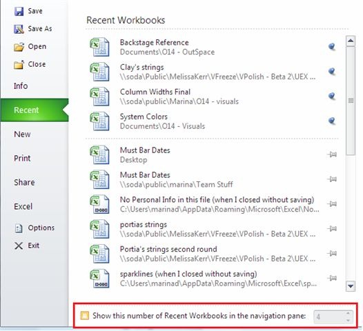
If you turn on this feature by clicking on the checkbox…The number of documents you choose will be shown along with the other “Quick Commands” at the top of the Backstage navigation pane.
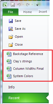
Turning this feature on also means that we’ll be able to use the keyboard sequence Alt+F+1 (or 2 or 3, etc) to open the most (or 2nd most, etc) recent document from the pinned documents in Recent tab and navigation pane.
These are the few major changes of Backstage View. Please note that these screenshots are still subject to change – they are from an interim build on the way to Beta later this fall.
Courtesy: Office 2010 Engineering Blog
Leave a Reply