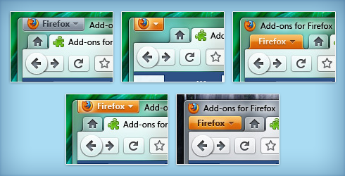
No doubt, Mozilla Firefox is holding 2nd highest market share after Internet Explorer. Firefox has possessed for years as for new features, stability and security, but this time v4 UI is more focused on UI evolution which is similar Windows 7 native applications UI (Paint and WordPad).

Since July, Mozilla Corporation is overhauling of UI for next major release of Firefox i.e. v4.0, The evolutionary work that was supposed to span 3.7 and 4.0 has now shifted full focus to the latter. Mozilla has been refining the conceptual UI for v4.0, that may be inspired by Windows 7 Ribbon UI.
Stephen Horlander says-
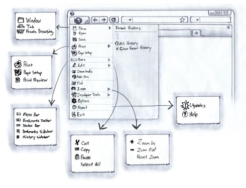
One of the benefits of the App Button is that it is similar to the way Microsoft is treating its native apps and Office. Another benefit is that the placement is closer to where the Menu bar would be and therefore it is more familiar.One idea that we have already explored with the Pages and Tools buttons is to use text on the button instead of an icon. This is also reminiscent of the Menu bar’s textual display and removes any ambiguity involved with icons. This approach is also explored in the most recent Office 2010 beta with the tab simply being labeled “File”. We discussed naming our App Button simply “Firefox” because it contains all the actions that apply to Firefox. Attaching the button to the top of the window further implies that this menu affects Firefox as a whole.”
 The advantages of evolution to Firefox UI:
- It is less complex
- Takes up less space
- Instead of two potentially conflicting locations for menu items, there is now only one unified location
- Can be placed in the upper left analogous to the Menu bar paradigm it is replacing
- Similar to the far more ubiquitous Office 2008/2010 + Windows 7 application menu
- Reduces clutter on the Navigation Toolbar
- It also creates a more flexible and rich canvas for perhaps doing some decidedly non-menu-esque things
Courtesy: Stephen Horlander Blog
Leave a Reply