Windows Explorer is the core component of the Windows desktop’s UX and over the years, Microsoft made substantial changes to bring improved interface and functionality for Windows operating system.
In Windows 8, one more time, Microsoft has made overwhelming changes in Explorer (based telemetry data of Windows 7). Here is a short video demo of these improvements:
Download this video to view it in your favorite media player:
High quality MP4 | Lower quality MP4
Windows 8 Explorer Changes:
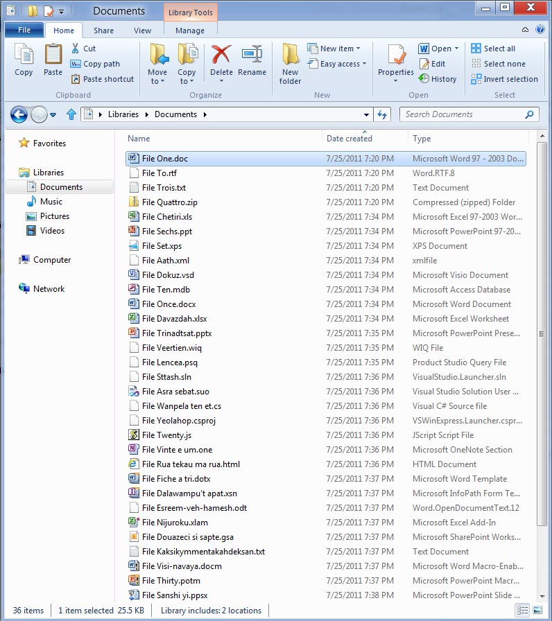
- New Ribbon UI
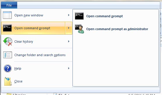
- New File menu with hidden features
- New Quick Access Toolbar (QAT)
- Details Pane gives more details, aligned to Right Side
- Improved Status bar
- Old “Up” button returned
- Traditional Menu Bar removed
- Command Bar (Taskband) removed

How Windows 8 Explorer advanced?
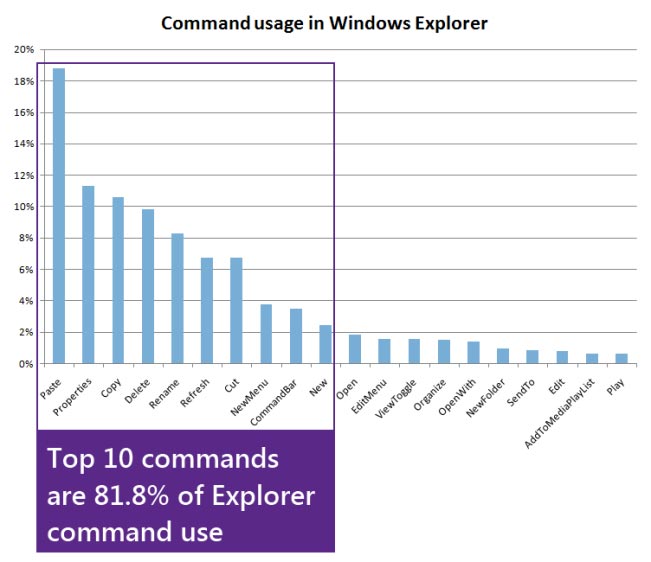
Ribbon UI now is the part of Windows Explorer. As study says 10 out of 200 commands in Explorer are used more frequently, representing 81.8% of total usage. Additionally it also shows 7 commands (72.2% of usage) among top 10 commands are all for file management jobs.

Microsoft had opportunity and they decided to bring Ribbon UI to Explorer with all the major file management commands there in prominent locations.
There are three default tabs, viz. Home, Share and View.

The Home tab comes with core file management commands including two popular heritage features, Move to and Copy to, along with exposing a hidden gem, Copy path (introduced in Vista). It exposes a large set of commands (~200) on this one tab without nested menus, popups, dialogs, and right-click menus.

The Share tab lets you zip, email, burn files and folders with a click. Besides you can also share files and folders with one-click access to ACLs.

The View tab gives complete control over view customization. You can turn on/off the Navigation pane, Preview pane, and Details pane. In addition it also provides easy access to three hidden features: show file name extensions, show hidden items, and hide selected items.

File menu, gives access your shortcuts, and change folder and search options. It also includes a hidden feature, Open command prompt, and a really useful new command, Open command prompt as administrator.

Quick Access Toolbar (QAT) in Explorer gives major level of customization with 200 commands and you can set them look like Windows XP.
Widescreen resolutions are common now-a-days and to use the widescreen effectively, Microsoft has shifted Details Pane from bottom to right side with more details while Status bar gets some jobs with few commands and shows critical information about files and folders.
Finally Microsoft welcomes some heritage features and brings the old “Up” button in Explorer that was removed in Windows Vista.

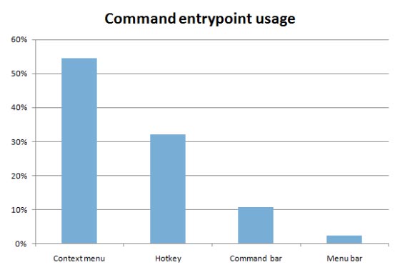
As study says 54.5% of commands are invoked using a right click, 32.2% are invoked using keyboard shortcuts while less than 15% come Command Bar (TaskBand) and Menu bar; reason being we have to say bid adieu to old Menu bar and Command Bar now.
Source: B8 Weblog

Leave a Reply