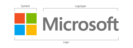
So finally Microsoft has got right time to change its visual identity. After long 25 years, the company has officially unveiled its new logo incorporating a multicolored symbol followed by the logotype.
As Microsoft explained, the logo has two components:

The logotype: The name typed Microsoft, is in Segoe font which is being used by the company in their online and printed marketing materials, including recent logos for a number of products.
The symbol: A pictogram of four colored squares resembling Microsoft Store logo, is the new addition to the logo. Its colors represent all the different products from Windows 8 to Windows Phone 8 to Xbox services to the next version of Office.
Watch this official video showcasing how they have evolved the new logo.
http://www.youtube.com/watch?v=OzkZWvAJUr0

Leave a Reply